
I have selected two typefaces which are part of my favorite "typelist" and I am going to present them here as part of my Task 1 - Critical debates in design. I like using different typefaces these days but I think that I am more focused on these two types lately.
1. Rockwell
My first choice is Rockwell a version of a geometric slab serif design, which has retained its popularity since its appearance in the 1930's. The Monotype Corporation produced its version of Rockwell in 1934. Unfortunately, some of the literature erroneously referred to it as Stymie Bold, thereby creating confusion that still exists today. Rockwell is notable for its judiciously clipped slab serifs, and is given a particular sparkle by means of its angular terminals. In more recent years this style of typeface has been increasingly used for text setting where their even color and visual impact can be fully exploited. Rockwell is a geometric slab serif design. Like many of its square-serif cousins, Rockwell has very heavy serifs with no bracketing. Changes in stroke weight are imperceptible. Rockwell is a geometric slab serif design, a strong display face for headlines and posters. It is also used for display rather than lengthy bodies of text. I must admit that recently I am using Rockwell frequently!


2. Meta
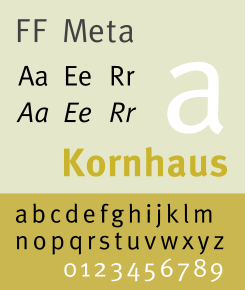
FF Meta is a wonderful typeface designed by Erik Spiekermann.
It is a humanist sans-serif typeface family designed originally as a commission for the Deutsche Bundespost (West German Post Office), but later released
by Spiekermann himself in 1991.
PT 55, the design that would later become FF Meta, was devised by Erik Spiekermann for the German Post Office in 1985. The Post Office, who was using Helvetica at that time, cancelled their commission at the last minute. Spiekermann's design went into hibernation.
The font family was released between 1991 and 1998.
Around the same time Spiekermann and several of his colleagues revived their dormant
design, creating FF Meta, whose first weights were released in 1991.
Over the next 15 years, numerous more weights would be devised.
Font characteristics:
very readable typeface in smaller point sizes but also with enough
detail to display in large point sizes.
FF Meta is named after the studio which Spiekermann headed at the time, MetaDesign.
Meta is proud of the face, calling it the Helvetica
of the '90s. Meta was designed for
use at smallish sizes, but became more widely used by designers looking
for a workhorse typeface with range.
It has been adopted by numerous corporations and other organizations as a corporate typeface, for signage or in their logo. It can be found all around us.

Samples:


References:
http://typophile.com/node/13815
http://en.wikipedia.org/wiki/FF_Meta
http://www.webdesignerdepot.com/2011/07/interview-with-designer-and-typographer-erik-spiekermann/
No comments:
Post a Comment