Monday

TASK 5 - Ethics and social responsibility


- A group that caught my attention is Zerofee , an ethical design agency which creates visual identity and design for print and digital media, but not for irresponsible brands or companies. Alongside their commercial work, they constantly donate design to financially–challenged charities and good causes. 
Their approach to design and clear profile definition of…not using their skills to support brands and companies that they feel that have a negative impact on the society… makes them very special. They do not accept to work for clients that put profit before people or disregard the environment. They are determined not to help those who they believe do harm and they would rather benefit from them either. 
Their website offers information about their very clear vision and approach to design. Pictures down show one of their projects.
http://www.zerofee.org/ 


TRAID education pack. Materials designed for secondary school students to introduce them to the environmental and ethical issues presented by the fashion industry. Subject to careful environmental consideration throughout, right down to the choice of lamination materials, the pack is produced using a mixture of recycled and sustainably sourced components.


Design donation is the term they use for their policies of offering pro–bono design to financially–challenged charities, non–profits or causes they believe to be worthwhile, but disadvantaged. They are committed to providing access to professional design for those who couldn’t otherwise afford it, but would benefit immensely from its application. 

............................................................................................................................................ 

Bombs Vs. Books

- Other designer that I found interesting for my topic of research is Ian Bonner. His projects show his approach and social responsibility to his design concept work.


These two images by Ian Bonner were part of his integrated campaign ...to wake people up to the defense budget in this country vs the education budget.The brochure that accompanied these posters, states that the U.S. military ranks #1 in the world with a budget of $595 billion in 2010.In education however, the U.S. ranks 14th in the world. Its budget in 2010 has been crippled by an onslaught of budget cuts in at least 35 of the 50 states...

Ian says: 
Recession+ Military Budget = Education Budget Cuts
Do the Math.
...................................................................................................................................................
Recycle
These two pieces are part of a campaign by Ian Bonner to try to shame people into recycling. The printed plastic wraps would be applied to trash containers of people who were determined to be particularly wasteful and unwilling to recycle. 


If incentives don't work, maybe shame would. I had access to his projects while researching about social & environmental issues through Conciousbydesign.
..................................................................................................................................................
FREITAG bag
Another example of clever use of recycling (or reusing) is FREITAG bag.

Graphic designer brothers Markus and Daniel Freitag were on the lookout for a messenger bag. The
FREITAG brothers wanted a heavy-duty, functional and water-repellent bag to carry their designs. Their personal need turned into a business which now employs more than 120 people. Since their original messenger bag, the FREITAG brothers have developed and marketed several bags for women and men. FREITAG products now sell around the globe, in over 350 shops. They are made in Switzerland.

The Process
 
From truck till bag

Depending on weather conditions, truck tarpaulins are replaced every 5 to 8 years. They are a valuable raw material for FREITAG. 


Freitag bag

.....................................................................................................................................................................................................

References:

http://www.freitag.ch/  


Thursday

TASK 3 - Motion graphics


Motion graphics or digital media design as a design discipline incorporates
into itself moving image, sound and typography.  

One of the earliest motion graphic artists that had a traditional background in graphic design was Saul Bass (1920-1996). He designed the opening title sequences for many popular films such as The Man With The Golden Arm (1955), Vertigo (1958), Anatomy of a Murder (1959), North by Northwest (1959), and Psycho (1960).


Many other designers have contributed to the evolution of motion graphics, but Bass was an exceptionally talented designer, and is commonly cited as being a pioneer in the field.  

Some of his designs may seem relatively simple compared with today’s standards, but his designs were effective at communicating the mood or theme of the movies his graphics were introducing. At the time when Bass was starting out, all graphics were 
created by hand or with film cameras, without the aid of computers. 
Even relatively simple designs would require a lot of time and expense to produce.

Of all the current motion graphic designers, Kyle Cooper is a likely candidate for the most popular and influential.
He studied graphic design under Paul Rand at Yale University. He co-founded Imaginary Forces (1996) and after that decided that it was time for him to focus more on his creative work. He left Imaginary Forces after 7 years(2003) and founded the creative agency Prologue. His work in the field of film title design is often compared to Saul Bass.
Some major movies he has designed opening tiles for include: Seven, The Island of Doctor Moreau, Mission Impossible, Donnie Brasco, The Joy Luck Club, True Lies, Gattica, The Mummy, and The Horse Whisperer.

His work is considered by many professionals to be an example of the most successful motion graphic design. After seeing him talking about the Imaginery forces last week at the video presentation at studio, his quotes …”make a type do what it says” and…”entertain rather than inform” caught my attention. Cooper clearly puts emphasis on creativity rather than production. 


In contrast to the time when Saul Bass was designing title sequences for movies, Kyle Cooper and his partners at the Imaginary Forces studio have access to technology which allows them to work faster and with much less creative limitations.  

Today, we can see stunning examples of computer animation in the most unexpected places. Computer animation has had a huge impact advertising. New computerized billboards and other advertising spaces have appeared along highways that feature creative animation and design. 
These new advertising spaces eliminate the need for the physical replacement of signs. Cellular phones and mobile devices are putting the technology 
right in the palm of our hands. 


What does the future holds? 3D TV technology and 3D animation experiences are being rapidly moving forward to the new developments. 
The field of computer animation only promises to expand into the future.  
Some 3D projection mapping graphics videos.


The sample above was a joint project of my BA with one of my colleagues.


REFERENCES:


superminds

After several attempts, inspired by New Alphabet  a geometric typeface designed by Wim Crouwel, released in 1967, I came up with these solution.


Inspiration:


Result:


Logo Design

During last months I have been continuously working on my company identity SUPERMINDS, part of Business for design tasks... Down here I will show you some of the solutions I have passed through.


This is another another experiment with different style.


After some feedbacks, another approach.


Wednesday

TASK 4 - Corporate social responsibility (CSR)


Corporate Social Responsibility is the commitment by companies to contribute to a better society and a cleaner environment. Other definition is that CSR is about how companies manage the business processes to produce an overall positive impact on society or how they incorporate social and environmental concerns and also ethical standards in their business operations. A company which shows a good CSR policy is Nike.


“It’s not just about getting better at what we do – addressing impacts throughout our supply chain – it’s about striving for the best, creating value for the business and innovating for a better world. Athletes push themselves toward higher and higher levels of performance. They want to achieve that breakthrough moment, their personal best. As environmental, social and economic challenges in our world proliferate, they demand our best performance.” That`s their approach to corporate responsibility.


The reason why I chose Nike is their market position as on of the world's leading athletic brand. “We’re using the power of our brand, the energy and passion of our people and the scale of our business to create meaningful change. The opportunity is greater than ever for our sustainability strategy to drive business growth, build deeper consumer and community connections, and create positive social and environmental change. We’re focusing our corporate responsibility efforts in the areas in which we can have the greatest impact and create the most value: Through the materials we design into our products, through the process of making those materials and products, and in the world of sport where our products are used.”

Values, ethics and moral responsibility
Like everyone in their professional activities, designers have responsibilities not only to their clients or employers but to society as well. A graphic designer cannot be separated from the social dynamics that happen around him. For instance, when a designer sees global warming destructs the earth he has to do something. Graphic designers must use their work to increase public awareness of a variety of social issues. Across the globe as well as on an individual level, they are being challenged to create work that’s socially responsible.


Different viewpoint

Henry Steiner is a designer with a different viewpoint, believing that graphic design does not have any moral implication. He cited as an example the Nazi’s swastika symbol, explaining it was the most successful and important corporate identity created in the 20th century. Although the entire world condemns what Adolf Hitler and Nazi had done, 
it does not imply that the swastika is a bad design.
...part of a designer’s personal ethics requires the ability to communicate, understand and identify the client’s problems. Therefore, to Steiner, social responsibility has nothing to do with professional design standards.
Except ethics and values, I think that my personal social responsibilities as a designer must be focused more on sustainable design solutions.


Thursday

Signage & wayfinding


I just came across this web. while researching about typography and what I found is very strong and impressive works...I thought to share the link with you!
They have been involved in some signage and wayfinding projects and 
I really like what they do.


büro uebele
Signage system and interior design adidas Laces 2011
www.uebele.com

http://www.uebele.com/en/projekte/orientierungssystem/adidas-laces.html#i1


Monday

TASK 2 - Wayfinding

WAYFINDING
Contemporary sign system

Wayfinding encompasses all of the ways in which people orient themselves in physical space and navigate from place to place. In more modern times, it has been used in the context of architecture to refer to the user experience of orientation.

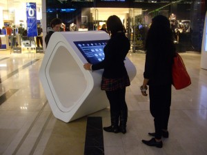
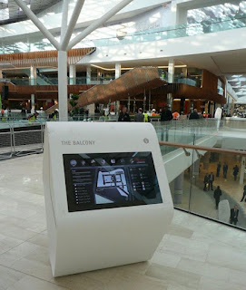
As part of my second task of “Wayfinding” at Critical debates in Design, I have chosen to evaluate the Westfield shopping center wayfinding system.
At the end of 2008, the Westfield Shopping Centre (Shepherds` Bush, London) was opened, an indoor shopping centre whose dimensions in area and exploitation potential can only be described as ‘spectacular’. It was the largest urban shopping centre ever, a city within a city. You can also find banks and pharmacies there, as well as cinemas and restaurants, whose international diversity offers a vast selection to satisfy the tastes of its visitors.
 

The internal life of this empire of progressive experience offers an enormous wealth of shopping and recreational possibilities, to include spas, sports and culinary facilities. Westfield integrates exclusive designer boutiques and fashion shops with supermarkets and dry cleaning stores, all under one roof. While researching I have found out that Westfield commissioned PearsonLloyd to deliver a unified concept for all the on-mall messaging and signage which included static wayfinding, digital signage, concierge reception desks and interactive wayfinding information points. They were provided and technically implemented by Rosskopf & Partner. Due to its optimum possibilities of translucence and thermal shaping, solid surface material was selected for manufacturing all of these elements. The ingenious results in forming these exceptional objects can be seen throughout the centre. Individual objects were designed that called for progressive solutions that previously had never been produced in this form anywhere in the world. The unique organic shapes conceived by PearsonLloyd were fabricated from LG Hi-Macs by world leading manufacturers Rosscopf and Partner AG with the Concierge Reception desks actually being fabricated on site.
10 Squared were commissioned by Westfield to modify the conceptual designs of the Interactive Rings to ensure that form did not compromise function and then to design, manufacture and install the touch screen technology module. In all, 32 interactive screens were installed including the 4 screens on the Concierge Reception Desks. Each screen is direct sunlight viewable and in order to provide the highest possible screen clarity is glass bonded, which has the added benefit of making the screen incredibly rugged.

The idea, aesthetic, choice of materials and technical implementation of innovative ideas were translated into formats that are best described as ‘avant-garde’. On the other side, except the futuristic forms unseen before (for me) I can say that the system of orientation and digital map screens there show us how sophisticated is the way of communication and how their client-connection is established. However, while this contemporary sign system does his job very well, I think that sometimes there is not enough information and I can find it a bit confusing to find the displays in such a big mall.
Even though that at the beginning the wayfinding system may not be familiar with all ages, which may have trouble finding them due to size of the facility in general and problems to navigate due to some of their digital forms, I think that this system has brought some new standards of modern signage, image and communication. 


References:
http://www.rosskopf-partner.co.uk/case-studies/westfield-shoppingcentre/benoy-international-architects/ http://www.rosskopf-partner.co.uk/case-studies/westfield-shoppingcentre/westfield-group/
http://www.10squared.co.uk/westfield.htm
http://en.wikipedia.org/wiki/Wayfinding