Thursday

Signage & wayfinding


I just came across this web. while researching about typography and what I found is very strong and impressive works...I thought to share the link with you!
They have been involved in some signage and wayfinding projects and 
I really like what they do.


büro uebele
Signage system and interior design adidas Laces 2011
www.uebele.com

http://www.uebele.com/en/projekte/orientierungssystem/adidas-laces.html#i1


Monday

TASK 2 - Wayfinding

WAYFINDING
Contemporary sign system

Wayfinding encompasses all of the ways in which people orient themselves in physical space and navigate from place to place. In more modern times, it has been used in the context of architecture to refer to the user experience of orientation.

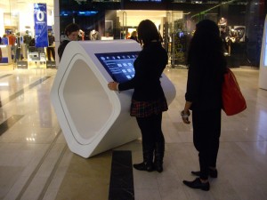
As part of my second task of “Wayfinding” at Critical debates in Design, I have chosen to evaluate the Westfield shopping center wayfinding system.
At the end of 2008, the Westfield Shopping Centre (Shepherds` Bush, London) was opened, an indoor shopping centre whose dimensions in area and exploitation potential can only be described as ‘spectacular’. It was the largest urban shopping centre ever, a city within a city. You can also find banks and pharmacies there, as well as cinemas and restaurants, whose international diversity offers a vast selection to satisfy the tastes of its visitors.
 

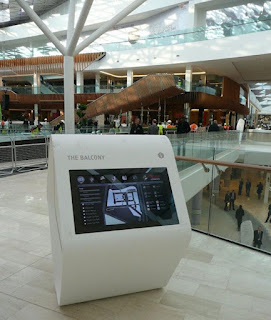
The internal life of this empire of progressive experience offers an enormous wealth of shopping and recreational possibilities, to include spas, sports and culinary facilities. Westfield integrates exclusive designer boutiques and fashion shops with supermarkets and dry cleaning stores, all under one roof. While researching I have found out that Westfield commissioned PearsonLloyd to deliver a unified concept for all the on-mall messaging and signage which included static wayfinding, digital signage, concierge reception desks and interactive wayfinding information points. They were provided and technically implemented by Rosskopf & Partner. Due to its optimum possibilities of translucence and thermal shaping, solid surface material was selected for manufacturing all of these elements. The ingenious results in forming these exceptional objects can be seen throughout the centre. Individual objects were designed that called for progressive solutions that previously had never been produced in this form anywhere in the world. The unique organic shapes conceived by PearsonLloyd were fabricated from LG Hi-Macs by world leading manufacturers Rosscopf and Partner AG with the Concierge Reception desks actually being fabricated on site.
10 Squared were commissioned by Westfield to modify the conceptual designs of the Interactive Rings to ensure that form did not compromise function and then to design, manufacture and install the touch screen technology module. In all, 32 interactive screens were installed including the 4 screens on the Concierge Reception Desks. Each screen is direct sunlight viewable and in order to provide the highest possible screen clarity is glass bonded, which has the added benefit of making the screen incredibly rugged.

The idea, aesthetic, choice of materials and technical implementation of innovative ideas were translated into formats that are best described as ‘avant-garde’. On the other side, except the futuristic forms unseen before (for me) I can say that the system of orientation and digital map screens there show us how sophisticated is the way of communication and how their client-connection is established. However, while this contemporary sign system does his job very well, I think that sometimes there is not enough information and I can find it a bit confusing to find the displays in such a big mall.
Even though that at the beginning the wayfinding system may not be familiar with all ages, which may have trouble finding them due to size of the facility in general and problems to navigate due to some of their digital forms, I think that this system has brought some new standards of modern signage, image and communication. 


References:
http://www.rosskopf-partner.co.uk/case-studies/westfield-shoppingcentre/benoy-international-architects/ http://www.rosskopf-partner.co.uk/case-studies/westfield-shoppingcentre/westfield-group/
http://www.10squared.co.uk/westfield.htm
http://en.wikipedia.org/wiki/Wayfinding

TASK 1 - Two typefaces


I have selected two typefaces which are part of my favorite "typelist" and I am going to present them here as part of my Task 1 - Critical debates in design. I like using different typefaces these days but I think that I am more focused on these two types lately.

1. Rockwell

My first choice is Rockwell a version of a geometric slab serif design, which has retained its popularity since its appearance in the 1930's. The Monotype Corporation produced its version of Rockwell in 1934. Unfortunately, some of the literature erroneously referred to it as Stymie Bold, thereby creating confusion that still exists today. Rockwell is notable for its judiciously clipped slab serifs, and is given a particular sparkle by means of its angular terminals. In more recent years this style of typeface has been increasingly used for text setting where their even color and visual impact can be fully exploited. Rockwell is a geometric slab serif design. Like many of its square-serif cousins, Rockwell has very heavy serifs with no bracketing. Changes in stroke weight are imperceptible. Rockwell is a geometric slab serif design, a strong display face for headlines and posters. It is also used for display rather than lengthy bodies of text. I must admit that recently I am using Rockwell frequently!


2. Meta 
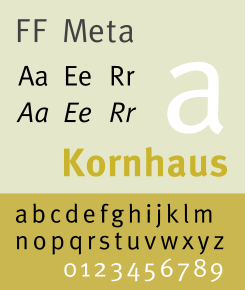
FF Meta is a won­der­ful type­face designed by Erik Spiek­er­mann. 
It is a humanist sans-serif typeface family designed originally as a commission for the Deutsche Bundespost (West German Post Office), but later released 
by Spiekermann himself in 1991.
PT 55, the design that would later become FF Meta, was devised by Erik Spiekermann for the German Post Office in 1985. The Post Office, who was using Helvetica at that time, cancelled their commission at the last minute. Spiekermann's design went into hibernation.
The font fam­ily was released between 1991 and 1998. 
Around the same time Spiekermann and several of his colleagues revived their dormant design, creating FF Meta, whose first weights were released in 1991. Over the next 15 years, numerous more weights would be devised. 
Font characteristics: 
very read­able type­face in smaller point sizes but also with enough 
detail to dis­play in large point sizes.
FF Meta is named after the studio which Spiekermann headed at the time, MetaDesign. 
Meta is proud of the face, calling it the Helvetica of the '90s. Meta was designed for use at smallish sizes, but became more widely used by designers looking for a workhorse typeface with range.
It has been adopted by numerous corporations and other organizations as a corporate typeface, for signage or in their logo. It can be found all around us.


Samples:


References:
http://typophile.com/node/13815
http://en.wikipedia.org/wiki/FF_Meta
http://www.webdesignerdepot.com/2011/07/interview-with-designer-and-typographer-erik-spiekermann/