Monday

TASK 2 - Wayfinding

WAYFINDING
Contemporary sign system

Wayfinding encompasses all of the ways in which people orient themselves in physical space and navigate from place to place. In more modern times, it has been used in the context of architecture to refer to the user experience of orientation.

As part of my second task of “Wayfinding” at Critical debates in Design, I have chosen to evaluate the Westfield shopping center wayfinding system.
At the end of 2008, the Westfield Shopping Centre (Shepherds` Bush, London) was opened, an indoor shopping centre whose dimensions in area and exploitation potential can only be described as ‘spectacular’. It was the largest urban shopping centre ever, a city within a city. You can also find banks and pharmacies there, as well as cinemas and restaurants, whose international diversity offers a vast selection to satisfy the tastes of its visitors.
 

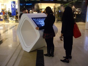
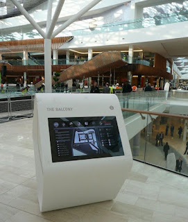
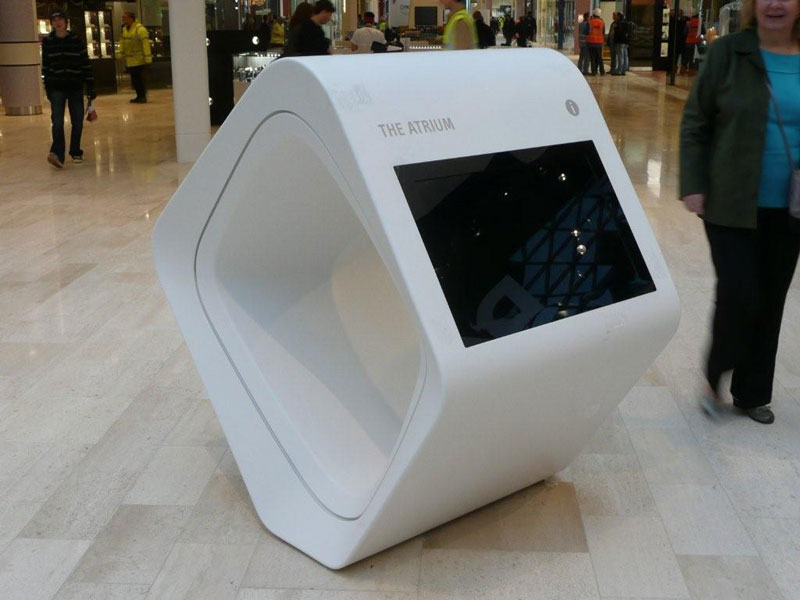
The internal life of this empire of progressive experience offers an enormous wealth of shopping and recreational possibilities, to include spas, sports and culinary facilities. Westfield integrates exclusive designer boutiques and fashion shops with supermarkets and dry cleaning stores, all under one roof. While researching I have found out that Westfield commissioned PearsonLloyd to deliver a unified concept for all the on-mall messaging and signage which included static wayfinding, digital signage, concierge reception desks and interactive wayfinding information points. They were provided and technically implemented by Rosskopf & Partner. Due to its optimum possibilities of translucence and thermal shaping, solid surface material was selected for manufacturing all of these elements. The ingenious results in forming these exceptional objects can be seen throughout the centre. Individual objects were designed that called for progressive solutions that previously had never been produced in this form anywhere in the world. The unique organic shapes conceived by PearsonLloyd were fabricated from LG Hi-Macs by world leading manufacturers Rosscopf and Partner AG with the Concierge Reception desks actually being fabricated on site.
10 Squared were commissioned by Westfield to modify the conceptual designs of the Interactive Rings to ensure that form did not compromise function and then to design, manufacture and install the touch screen technology module. In all, 32 interactive screens were installed including the 4 screens on the Concierge Reception Desks. Each screen is direct sunlight viewable and in order to provide the highest possible screen clarity is glass bonded, which has the added benefit of making the screen incredibly rugged.

The idea, aesthetic, choice of materials and technical implementation of innovative ideas were translated into formats that are best described as ‘avant-garde’. On the other side, except the futuristic forms unseen before (for me) I can say that the system of orientation and digital map screens there show us how sophisticated is the way of communication and how their client-connection is established. However, while this contemporary sign system does his job very well, I think that sometimes there is not enough information and I can find it a bit confusing to find the displays in such a big mall.
Even though that at the beginning the wayfinding system may not be familiar with all ages, which may have trouble finding them due to size of the facility in general and problems to navigate due to some of their digital forms, I think that this system has brought some new standards of modern signage, image and communication. 


References:
http://www.rosskopf-partner.co.uk/case-studies/westfield-shoppingcentre/benoy-international-architects/ http://www.rosskopf-partner.co.uk/case-studies/westfield-shoppingcentre/westfield-group/
http://www.10squared.co.uk/westfield.htm
http://en.wikipedia.org/wiki/Wayfinding

TASK 1 - Two typefaces


I have selected two typefaces which are part of my favorite "typelist" and I am going to present them here as part of my Task 1 - Critical debates in design. I like using different typefaces these days but I think that I am more focused on these two types lately.

1. Rockwell

My first choice is Rockwell a version of a geometric slab serif design, which has retained its popularity since its appearance in the 1930's. The Monotype Corporation produced its version of Rockwell in 1934. Unfortunately, some of the literature erroneously referred to it as Stymie Bold, thereby creating confusion that still exists today. Rockwell is notable for its judiciously clipped slab serifs, and is given a particular sparkle by means of its angular terminals. In more recent years this style of typeface has been increasingly used for text setting where their even color and visual impact can be fully exploited. Rockwell is a geometric slab serif design. Like many of its square-serif cousins, Rockwell has very heavy serifs with no bracketing. Changes in stroke weight are imperceptible. Rockwell is a geometric slab serif design, a strong display face for headlines and posters. It is also used for display rather than lengthy bodies of text. I must admit that recently I am using Rockwell frequently!


2. Meta 
FF Meta is a won­der­ful type­face designed by Erik Spiek­er­mann. 
It is a humanist sans-serif typeface family designed originally as a commission for the Deutsche Bundespost (West German Post Office), but later released 
by Spiekermann himself in 1991.
PT 55, the design that would later become FF Meta, was devised by Erik Spiekermann for the German Post Office in 1985. The Post Office, who was using Helvetica at that time, cancelled their commission at the last minute. Spiekermann's design went into hibernation.
The font fam­ily was released between 1991 and 1998. 
Around the same time Spiekermann and several of his colleagues revived their dormant design, creating FF Meta, whose first weights were released in 1991. Over the next 15 years, numerous more weights would be devised. 
Font characteristics: 
very read­able type­face in smaller point sizes but also with enough 
detail to dis­play in large point sizes.
FF Meta is named after the studio which Spiekermann headed at the time, MetaDesign. 
Meta is proud of the face, calling it the Helvetica of the '90s. Meta was designed for use at smallish sizes, but became more widely used by designers looking for a workhorse typeface with range.
It has been adopted by numerous corporations and other organizations as a corporate typeface, for signage or in their logo. It can be found all around us.


Samples:


References:
http://typophile.com/node/13815
http://en.wikipedia.org/wiki/FF_Meta
http://www.webdesignerdepot.com/2011/07/interview-with-designer-and-typographer-erik-spiekermann/


Tuesday

TASK 9 - Project A, Critical reflection


Project A
Circle of Life - Critical reflection

The Circle of life project is my design solution to the RSA brief “Something for everyone” and its aim was “to design a coherent solution that addresses the need for greater intergenerational links resulting in the fuller integration of older and younger people into the community” (RSA Projects, 2011, p.8). As part of my project I have used findings of primary and secondary research. The scenario of bringing generations closer especially the elderly that these days are facing loneliness, is very current all over the world. “Lonely older people are as different as any other individuals, and have different needs and expectations” (Cattan, 2011)
They miss a lot of things, one of them and most important is love, care of their siblings and relatives and of course their mutual communication. “Depression affects 22% of men and 28% of women aged 65 or over. This would be just over 2 million people aged 65+ in England”. (Age UK, 2011). As part of my primary research I have created 3 types of questionnaires with which I started to contact people of my focus groups from my family and neighborhood, researching locally and approaching different organizations. During the research I have passed through different prepositions, from intergenerational days to some workshops and drama ideas. I have also contacted and made interviews with people and organizations, approaching them for my project. Some of them were cooperative answering my questions or directing me to more competent people.I have created contacts with Mr. Ben Long, the person in charge for intergenerational relationships at Age Concern. He provided me with some really useful answers and explained me how he liked the idea and told me that it works because they already did something like that. They do it every year and it is called Acting up.

This was one of the important moments of my research stage which lead me to some new territories  combining their insights with my in depth secondary research, examining mostly online resources and redefining and simplifying my concept to an idea of an interactive storytelling game. During my visit to Science museum, I have found very inspiring some digital interactive round table games and throughout the discussions with my tutor I came up with an idea of interactive mechanic table game, which is more user friendly for the elderly and interesting for youngsters.Expanding my research at a further stage I have passed through some types of expandable tables, which was fundamental to my general idea of moving layered table. The idea is to create an activity similar to a game involving the young people and the elderly around a table where they can share their experiences from their past while telling stories which can be recorded and showing photos which if agreed can remain as an archive of the host organization and then used for certain purposes, egg. monographs, exhibitions and documentaries.

It will work if at least monthly such a event or activity would be held at different organizations that deals with age concerns, with different age people that have chance to meet each other from different generations, especially the elderly. “It's important to look not only at what older adults need, but also what they can give. Young and old can give to each other; it's a two-way relationship” (Bosak, 2001). After additional presentations of my concept for a roundtable game divided by topics and first feedback's, there were refining possibilities identified, for instance adding story-subtopics and re-organizing the timing of the game. To test my game I have made a simple small-scale model, played and discussed it with people of my focus groups, my family and friends. The idea was well received and playing with it was fun and entertaining. With new features like timing, subtopics and design development it became more interesting. Also, the idea of collecting their stories for a documentary has attracted attention.

After that channels to communicate with the audience were chosen and material was designed and redesigned again after consultations with my tutor that led me to the final solution. One of my first proposals was to include a partial view of the table-game with its mask in motion in the posters and other communication channels but after the review and feedback I realized that the mixture of different styles of design was very complex and confusing. I came up with a very simple solution and it was one of the strengths of the project as advised, and it was also used as a style of presenting the topics in the game. Pushing the idea forward and simplifying design elements of communication was one of the most important moments of the project. The shape of arrow designed with different typefaces of topics and subtopics at the table-game has given the project a modern and unique identity. Also, the “Circle of life” final logo solution relates to the typographic arrow style used in other elements, where the name and strap line form an arrow too. The arrow shape made of simple typography of storytelling topics is used in all the material from flyers to t-shirts.

Overall, I am satisfied with the outcome of the project .The process of design development throughout the time was well organized and with a lot of time for all stages. However I think that research phase took me to long but it was reasonable taking into account that here in UK is done a lot in this direction which positively surprised me in comparison to what is done in my country and In-depth research helped me to better understand the problem and as a final result come up with a stronger solution. If I had the chance to redo this project, I would like to have planned my time and manage it more reasonably making my research better structured, particularly on the conceptual stage of this project. Also, I wish I would have a chance to produce the real prototype and test how it actually works.

REFERENCES
1. Fiell, C. and Fiell, P., (2003). Graphic design for the 21st Century UK: Taschen.
2. Mollerup, P., (1997). Marks of Excellence: The History and Taxonomy of Trademarks UK: Phaidon.
3. Mau, B., (2000). Lifestyle UK: Phaidon.
4. Noble, I. and Bestley, R., (2005). Visual Research: An Introduction to Research Methodologies in Graphic Design. Switzerland: Ava.
5. Roberts, L. and Thrift, J., (2005). The Designer and the Grid UK: RotoVision.

 .............................................................................................................................
1. Acting up (2011). Everyone goes gaga for acting up. [online] Available from:   <http://content.met.police.uk/News/Everyone-goes-GaGa-for-Acting-Up/1400002123542/1257246745756>[Accessed: 03 November 2011].
2. Allen, J., (2008). Older people and wellbeing. London: Institute for Public Policy Research, Research report 01, [online] Available from: <http://www.ippr.org/publications/55/1651/older-people-and-wellbeing> [Accessed: 16  November 2011].
3. Age UK (2011). Mental health: Later life in the United Kingdom. [online] Available from: <http://www.ageuk.org.uk/publications/age-uk-information-guides-and-factsheets/> [Accessed: 08 December 2011].
4. Bosak, S., (2001). The Legacy project: Grandparents day kit: Give and take, [online] Available from: <http://tcpnow.com/grandparentsdaykit/part2/gpday2.8b.html#anchor2.8.19> [Accessed: 06 November 2011].
5. Cattan, M., (2011). Safeguarding the Convoy: A call to action from the Campaign to End Loneliness. [online] Available from: <http://www.campaigntoendloneliness.org.uk/information-on-loneliness/loneliness-research/> [Accessed: 15 November 2011].

6. Campaign to end loneliness (2011). Virtually friends. [online] Available from:. <http://www.campaigntoendloneliness.org.uk/campaign-team/virtually-friends/>
[Accessed: 20 October 2011].
7. Campaign to end loneliness (2011). Sharing loneliness. [online] Available from: <http://www.campaigntoendloneliness.org.uk/campaign-team/sharing-loneliness/>
[Accessed: 6 January 2012].
8. Communities and neighbourhoods (2009). Guidance on meaningful interaction: How encouraging positive relationships between people can help build community cohesion [online] Available from: <http://www.communities.gov.uk/publications/communities/meaningfulinteraction>[Accessed: 23 November 2011].
9. New horizonts (2011). Time for me. [online] Available from: <http://www.new-horizons-chelsea.org.uk/nh/index.php?n=Main.TimeForMe> [Accessed: 30 October 2011].

10. RSA Projects (2011), Something for everyone: Use design to bring the generations together [online] Available from: <http://www.thersa.org/projects/design/student-design-awards/rsa-student-design-awards-201112/something-for-everyone> [Accessed: 12 October 2011].


11. RSA Projects (2011). Connected communities. [online] Available from: <http://www.thersa.org/projects/connected-communities> [Accessed: 18 November 2011].